
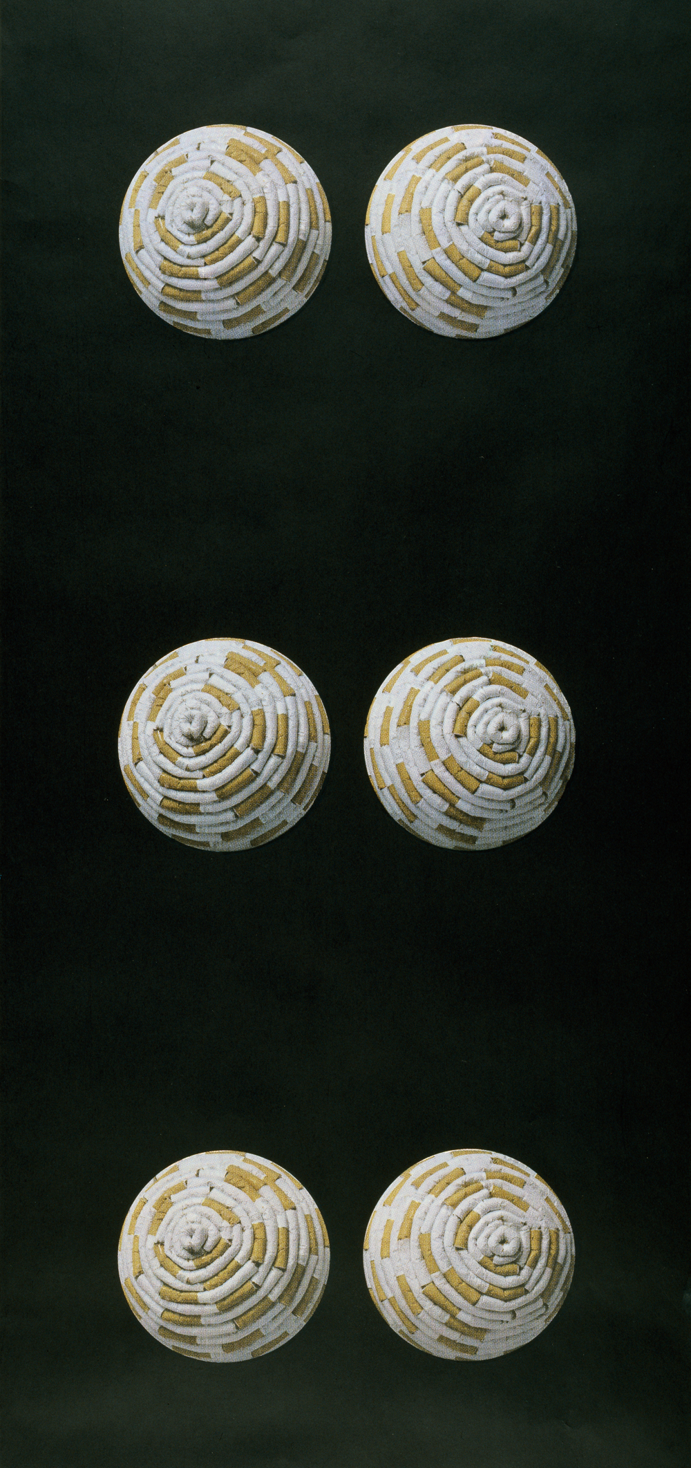
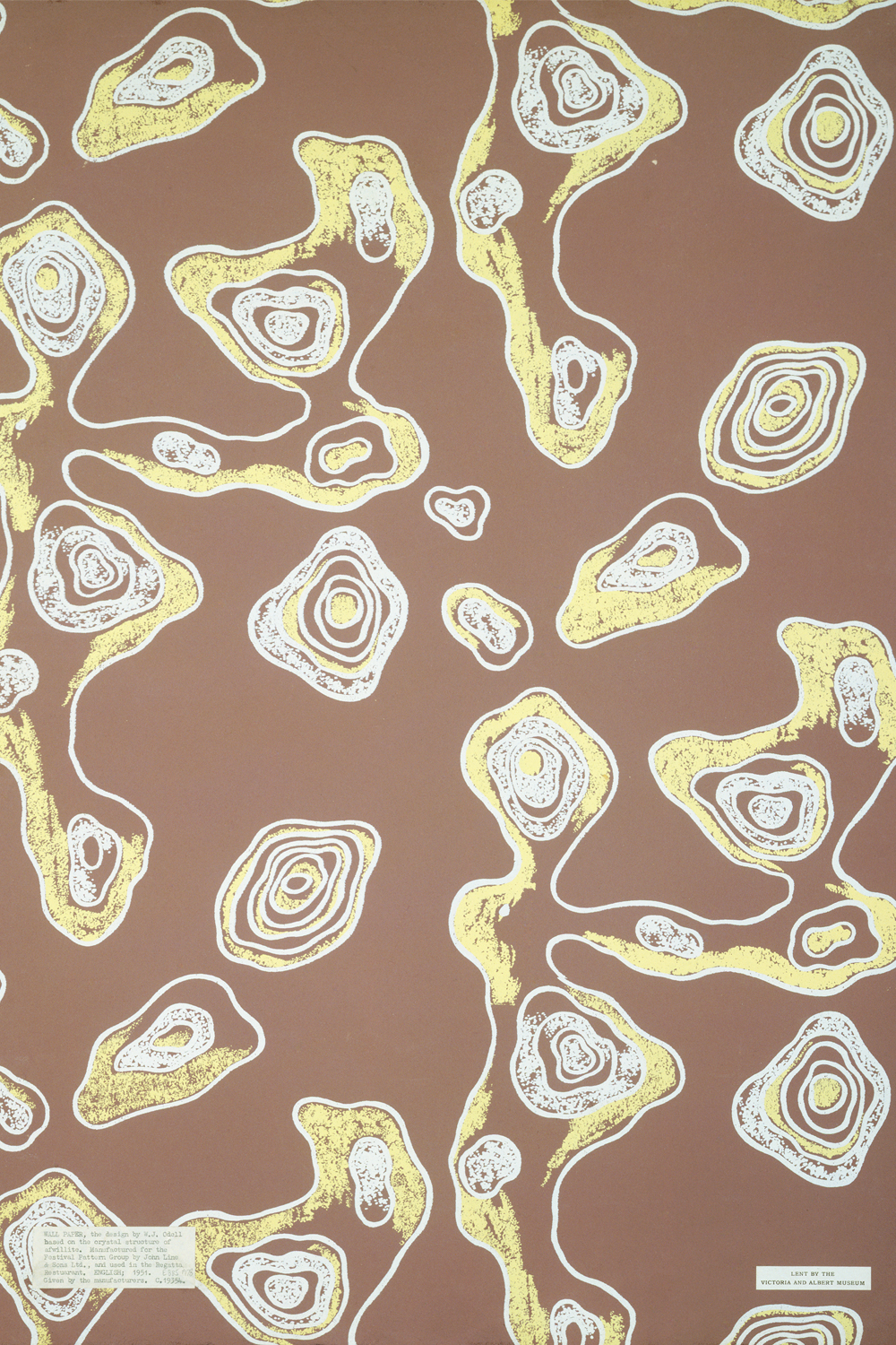
Wallpaper in the 20th century had become very much associated with the 'country house' look, with chintzy florals, Morris revivals and historic patterns predominating. There was a brief flowering of new and original design directions in the 1950s and 1960s, when architects and artists revitalised the industry; designers such as Lucienne Day initiated a trend for adventurous patterns inspired by contemporary painting and sculpture, while John Line's Palladio and Modus ranges were characterised by bold large-scale contemporary designs, many by artists new to wallpaper. However, this confident phase was soon overwhelmed by a taste for nostalgic patterns, reproductions and pastiches. And as one journalist put it, wallpaper in the 1990s had been a 'no-no', out of fashion for so long 'we're almost scared to say its name.'
A renaissance of sorts has been underway since the 1990s, as 1950s, 1960s and 1970s furnishings were rediscovered as design classics and retro styles found a new and enthusiastic audience in the style-conscious generation, readers of the new aspirational interiors magazines, Elle Decoration and Wallpaper. Original 1960s and 1970s wallpapers got a new lease of life as collectibles, used on feature walls or framed as pictures and murals. At the same time, the very unfashionability of wallpaper, which had become associated with a certain kind of restrained middle-class 'good taste', prompted designers to reinvent it.
One of the most striking aspects of the best contemporary wallpaper design is its rejection of traditional imagery and motifs, or the radical reworking of conventions. The new wallpapers take their cue from the best of the Palladio and Modus ranges, and use strong, uncompromising designs and colours.
David Oliver, who established a wallpaper range, the Paper Library, in 1998, claims he was inspired by the furore about 'the Chancellor's wallpaper' (the controversial refurbishment of the Lord Chancellor's apartments at the House of Lords in 1997). He said 'I just thought wallpaper was getting such a negative press, it was a wonderful time to do something new and fresh and funky.' Oliver deliberately avoided conventional motifs and certainly did not look to the history of wallpaper for inspiration. Instead, his first design, was based on a drawing he had made, tracing the white space between the columns, pictures and headlines in a copy of the French newspaper Libération. The result is a bold geometric pattern which has proved very popular; Oliver himself has used it in his hallway, where he says it has created a feeling of movement. It has since featured regularly as the backdrop to fashion and lifestyle features in magazines and newspaper colour supplements.
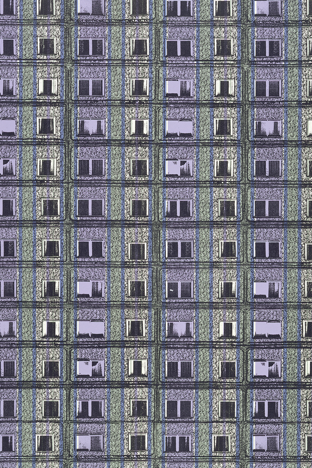
Minimalism, a decorating style which has largely coincided with an increase in 'loft-living' in converted industrial buildings or architect-designed urban developments, has tended to exclude the traditional use of wallpaper. Not only is there too much wall to cover, wallpaper itself still carries overtones of a cosy suburban domesticity which the urban loft-dweller is emphatically rejecting. However, artist and designer Sharon Elphick sees this shift towards living in larger open-plan spaces as an opportunity to use wallpaper in a new way. As she says 'People have got the space for an interesting paper without it dominating everything.' Again this is an acknowledgement of wallpaper's new place in the decorative hierarchy; it is not simply a background, but a feature which complements other furnishings and fittings, or serves as a talking point in its own right, much as a painting or poster might do. Inspired by her own photographic limited edition wall-panels, Elphick has designed the quintessential wallpaper for the inner-city loft - Prefab Stripe is an all-over repeat of an image of a 1960s prefabricated tower block. Printed in dull blues and greys with stripes of thinned colour veiling the image it perfectly captures the stained concrete façade, with its monotony and anonymity embodying the alienation of urban life; it also looks like a typical urban landscape viewed through a pall of rain - a neat replication of the likely view from the loft's picture windows!
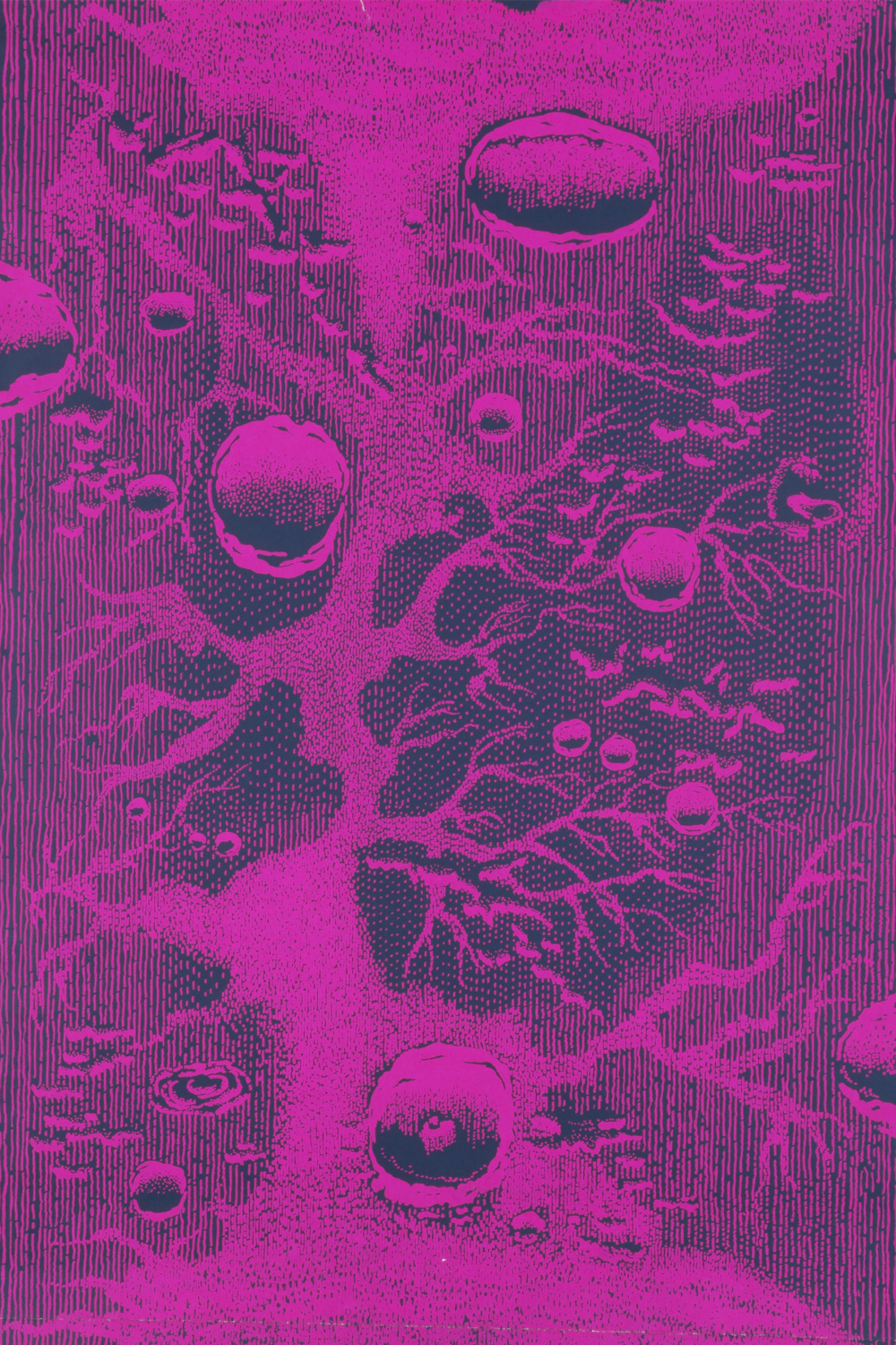
Several contemporary designs have been inspired by this idea that wallpaper should make some visual reference to the urban context, rather than reproducing the nostalgic fantasy of a rural lifestyle. In 1996 four wallpapers were commissioned by Glasgow's Centre for Contemporary Arts, and sold through the city's fashionable interiors store Nice House. These included David Shrigley's Industrial Estate, a cartoon vision of the anonymous uniformity of the contemporary urban landscape with everything from carpet warehouse to garage, church and sauna inhabiting the same brick box or blank walled shed. By his own admission, the paper would be 'very oppressive' to live with. Martin Boyce designed a geometric black, grey and white grid, From Now Until Night, intended to evoke the pattern of darkened office-block windows. He designed the paper for public spaces where people were simply passing through - hotel lobbies, waiting rooms, corporate foyers - rather than domestic settings. Domestic life itself provides the motif for Hayley Tomkins' design: a 'messy' collage of babies' heads in shades of pink, Cry Baby suggests that there can be a claustrophobic aspect to the domestic ideal.
Limited editions, commissions and unique prints have produced wallpapers with the kind of exclusive status previously enjoyed by flocks, Chinese papers and French scenics. One of the finalists in the Peugeot Design Awards for 2000 was Deborah Bowness with her Hooks and Frocks wallpaper. Each version of the design is unique to the client, whose furniture and possessions are photographed and reproduced in pictorial montages on lengths of wallpaper. When hung, real hooks are added, so the client can if they wish, hang the actual frock, shirt or bag over its two-dimensional counterpart. She has since produced a variety of trompe l'oeil papers with photographic imagery.
Ella Doran has also broken with the tradition of repeating pattern and conventional mural decoration in wallpapers such as Gloriosa, with its bold single image of a lily blown up to wall-size. She also produces more conventional repeating designs of photographed objects - shoals of fish, asparagus, artichokes and pebbles - but the images are manipulated on computer and can be printed so that every piece is different. This is expensive, about £700 ($1000) for one average living room wall, but the appeal lies in the fact that the decoration would be unique; as she says 'nobody else would have exactly what you've got.' And though these limited edition designs and one-off commissions are relatively dear, the cost is offset by using the paper on only one wall, in a corner or an alcove. Indeed, Doran sees her papers as being too assertive to be used for a whole room and says the result 'would be a nightmare.' In fact, the new generation of designs are generally limited to use on one wall - a 'feature' wall, as in the 1950s and 1960s. Advertising agency Mother has used original 1960s papers in this way in their Clerkenwell premises; textile designer Neisha Crosland likewise used her own wallpapers (for Paper Library) in her Fulham Road shop.
Wallpapers like these continue the trend which began in the late 19th century for the home and its furnishings to be seen as self-expression, an extension of the owner's personality and taste. 'Good taste' is no longer the issue - the kitsch, eccentric or ironic are all valid characteristics of personal taste, and are 'read' and appreciated as such by others.


0 comments: