It seems as if it's no easy task to create
an interlocking geometric pattern that can be easily set as a pattern
within Adobe Illustrator or Photoshop. In this tutorial, we'll break
down the shapes of a houndstooth pattern so that they fit into a simple,
repeating pattern that's easy to create, apply, and edit.
1. Create the Shapes in Illustrator
Step 1
Create a New Document of 500 px by 500 px. If you need a larger or smaller pattern, fear not: you can resize it as needed. Use the Rectangular Grid Tool to draw a 500 px by 500 px grid of 9 Horizontal and 9 VerticalDividers. Lock the grid in the Layers panel.
Step 2
Using the Rectangle Tool (M), draw a 250 px by 250 px square and place it in the top left quadrant of your artboard.
Step 3
In the bottom left quadrant, use the Pen Tool (P)
to draw a diagonal line starting at the fourth vertical line from the
left and ending at the third horizontal line from the bottom of the
grid. Bring the line down to the bottom corner of the grid and back up
and to the right, diagonally, to the center of the line grid. Finally,
close the shape with a horizontal line at the origin anchor point.
Step 4
Using the Pen Tool,
draw a triangle in the bottom right corner of the lower left quadrant
of the line grid. It should be three squares down and three squares
across.
2. Create the Vector Pattern
Step 1
Copy (Control-C) and Paste(Control-V) the diagonal strip and triangle shape. Rotate them 180° using the Rotate Tool (R) and place the two shapes in the top right quadrant. Group (Control-G) all black shapes together. Draw a 500px by 500 px square over the artboard. Make sure it's aligned perfectly.
Step 2
Delete or hide the line grid. Select the black and white design elements. In the Pattern Options panel, hit Make Pattern. Make sure Tile Type is set to Grid and hit Done at the top of the document to save your pattern in the Swatches panel.
Step 3
Apply your newly made pattern swatch to a rectangle within your artboard. If you need to resize or edit the pattern in any way, double-click on the swatch in the Swatches panel to edit it in the Pattern Options panel.
3. Creating the Pattern Shapes as a Bitmap
Step 1
The
steps in creating a houndstooth pattern as a bitmap are quite similar
to the vector format of Adobe Illustrator. In the case you're
using Adobe Photoshop only, I'll review all of the steps below.
Create a New Document of 500px by 500px. Go to View > New Guide Layout and create a Guide Layout of 10 Columns and 10 Rows (no width, height, or gutter values).
Step 2
With the Rectangle Tool (U), create a 250 px by 250 px square. Make sure the tool is creating a Shape and not a Path. Use the Move Tool (V) to place the square in the top left corner of the layout grid.
Step 3
Two shapes are to be drawn in the bottom left quadrant of the layout grid. Firstly, set the Pen Tool (P)'s Tool Mode to Shape in the Options Bar.
Secondly,
draw a diagonal line starting at the fourth vertical line from the
left and ending at the third horizontal line from the bottom of the
grid. Bring the line down to the bottom corner of the grid and back up
and to the right, diagonally, to the center of the layout grid. Finally,
close the shape with a horizontal line at the origin anchor point.
Thirdly, draw
a triangle in the bottom right corner of the lower left quadrant of the
layout grid. It should be three squares down and three squares across.
Step 4
Copy, Paste, and Rotate the diagonal strip shape and triangle so it fits perfectly in the top right quadrant. Go to Edit > Define Pattern and give your new pattern a name. Change the size of your pattern file under Image > Image Size as needed. Use the Paint Bucket Tool (G) to fill in a new document or selected area with your new pattern.
Fantastic Job, You're Done!
Well
done you! By looking at the pieces of an interlocking geometric
pattern, like houndstooth patterns, you've learned how to create both a
vector and a bitmap version of the seamless pattern.
What
fantastic color variations can you create with these simple geometric
shapes? Using the grid method, what other interlocking designs can you
create? Share with us in the comment section below!
Coffee rings are a special type of grunge effect that tends to turn accidents into elements. The fluid nature of the effect makes it difficult to reproduce digitally in a realistic manner. Fortunately, they are really easy to create practically, almost unavoidable even! Follow along as I demonstrate how to create, capture, digitize and use your very own Coffee Ring brushes!
1. The Practical Effect
To generate coffee rings, one technique might be to just swap out your coaster for a slip of paper on your desk. But I prefer a more controlled and intentional approach.
Step 1
Gather the materials for creating the practical effect. Use a heavyweight cardstock or other type of paper that is sturdy enough to withstand the spilled coffee without wrinkling. A small brush or sponge is helpful for controlling the liquid. Then the critical element is a mug of coffee: the darker the roast, the better.
Step 2
Place the mug of coffee on one of the sheets of paper and use the brush to gently apply some of the coffee to the rim. This is a much more controlled method than trying to spill it out of the mug.
Step 3
Move the mug and create more rings using various amounts of the coffee to control the thickness of the rings.
Step 4
Consider different patterns of the rings: make some overlap, create some with only partial rings, some with splashes, some without. They are quick and easy to create, so don't feel limited to the classic, single light ring. Add some variety!
Step 5
Allow the paper to air dry. Don't use a heat source or blow dryer, as that will move the liquid around and disrupt the natural patterns. You can speed up the process by carefully dipping the corner of a paper towel into the pooled liquid. The towel will absorb the excess fluid without spreading it further onto the paper.
2. Going Digital
Once the coffee rings have dried, it's time to digitize them! A good quality flatbed scanner is the best option for this.
Step 1
If the cardstock you chose doesn't fit flat onto your scanner surface, trim out the individual rings and scan the smaller pieces. Otherwise the uneven surface will introduce lighting anomalies in your scans. Scan the rings at a minimum of 600 dpi to generate nice, high quality images.
Step 2
Open up the scan image in Photoshop. Use the Polygonal Lasso Tool (L) to select an area around one of the rings.
Step 3
Go to Layer > New > Layer Via Copy (Control-J) to copy the coffee ring to a new layer. Then go to Image > Adjustments > Desaturate (Control-Shift-U). Photoshop only uses grey scale information to create a brush, so it's best if you view it without any color information.
Step 4
Go to Image > Adjustments > Levels (Control-L) to open the Levels adjustment. Slide the left-hand (white) slider handle towards the right to meet the edge of the histogram. Then slide the right-hand (black) slider towards the left just a touch to maximize the white areas. This should dramatically increase the contrast of the coffee ring.
Step 5
Hide the Background layer by clicking on the eye icon in the Layers panel to toggle the visibility. Then look for any stray marks around the coffee ring that may have been captured unintentionally. Use the BrushTool (B) with white paint to remove them.
Step 6
You will need to have an active selection to define the brush, so Control-Click on the layer thumbnail to create the selection. Then go to Edit > Define Brush Presetand give your coffee ring brush a name.
Step 7
If your BrushTool was still active, it would switch to be the newly defined brush. If not, you can still find it by opening the Brush Presets panel with Window > Brush Presets. The newly defined brush will be at the very bottom of the list.
Step 8
The brush is just like any other brush in Photoshop in that you can control the size, opacity, angle, blend mode, color, etc. It can be used as a tip for any of the brush-based tools like Dodge, Burn, Clone Stamp, Blur, etc. Keep in mind that custom brushes like these are not intended to be used in brush strokes. They are more like stamps, so use single clicks to apply them.
3. Use My Custom Brushes
I fully encourage you to develop your own set of custom brushes, and use them in your own digital projects. Realizing that practical effects are possible as a digital tool helps to expand your imagination of what's possible in your digital designs. To help you along the way, I've included a set of custom coffee ring brushes free for you to use! They range from bold to subtle and are all clean, high-resolution brushes.
Step 1
Look for the Download Attachment link next to this tutorial and download theCoffeeRings.abr file to your computer. Then open the Brush Presets panel and look for the panel menu located at the top right of the window. Choose Load Brushes and select the file you just downloaded.
Step 2
Scroll down to the bottom of your list of brush presets to find your new set of deliciously high-resolution Coffee Ring brushes!
Then go forth and boldly leave coffee rings everywhere you go, without worry of offending your hosts! Have you created your own brush set? Used them in a digital design? Show me in the comments below—I'd love to see them!
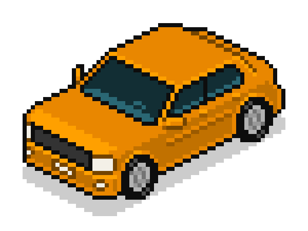
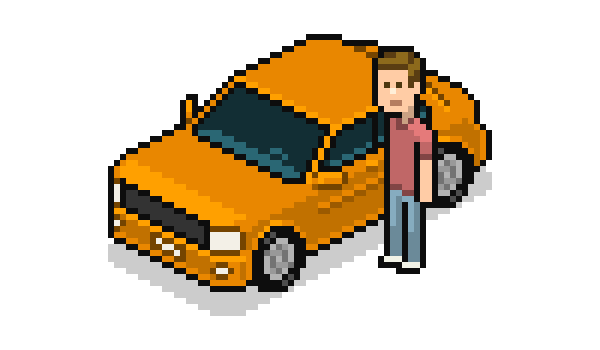
In this tutorial you'll learn to make an isometric pixel art car. Have your character ready; it's going for a ride.
We'll be creating a relatively generic sedan. It won't be too flashy, which is ideal for recycling many times over on the same illustration (useful if you're making a city scene!). But even though it'll be generic, it wouldn't hurt to see some reference images; maybe there are simple design elements from actual car models that you can incorporate into your car graphic.
Make sure you have already gone through the isometric pixel art character tutorial; it covers necessary basics for the illustration style, and we'll use the character created in that lesson as a sort of yardstick for the car.
1. Volumes
We'll start with the main shapes of the car, mostly rectangles at first and then some more interesting shapes.
Step 1
We'll be making a pretty average size car. So it should be wider than two of our characters, of course, as at least two should be able to sit side by side in it, and the length should be around twice the width. So let's make a rectangle to represent the footprint.
Step 2
The corners will not be straight and pointy, so let's round them up a bit.
Step 3
Select and copy the rounded rectangle and then fill it with black.
Lower the opacity on this layer to 20%.
Tip: you can change the opacity percentage by pressing numbers on your keyboard while the move tool is active. Pressing 2 equals 20% opacity.
Step 4
Once you have lowered the filled rectangle's opacity, paste the original rectangle right over it, leave it in a new layer, and move it up 4 px. We got the car's shadow done already; remember to update it if at any point you change the dimensions of the car.
Step 5
Now duplicate the car body's bottom line and place the copy 10 px higher (remember you can do this by selecting it, then pressing Alt-Shift-Up Arrow) or adjust this height as you see fit; keep your character around on another layer so you can check size against it whenever you want.
Step 6
Let's join those two rectangles and remove the background lines till we get this sort of flying brick!
Step 7
We'll give the car a rear bumper that projects out a little bit by selecting the top two corners and moving them down a pixel (and across two)
Step 8
Now add a rectangle to where you'd want the windows and windshields to start projecting up.
Step 9
Draw a diagonal line (1:1) from the leftmost corner of this new rectangle, and duplicate it so that two parallel diagonals project out of the brick shape. These lines will meet at the top with a new 2:1 line, which will be the car's roof.
The roof shouldn't be a lot higher than the previous top line (and should preferably be an even number of pixels higher, if you like being obsessive with detail).
Step 10
Now on the frontmost corner of the new rectangle we'll need another pair of lines to define the windshield. They won't be diagonals like the first lines, however, because windshields almost always get narrower as they go up, so they'll be 1:2 lines.
Step 11
Let's join these windshield lines to get the complete outlines for the front windshield. Delete the leftover pixels inside these outlines.
Step 12
Now we need another 2:1 line for the top outlines of the windows.
Let's get rid of those cluttering pixels:
And make a nice line to join the top and bottom window outlines at the back of the car; I chose to make them with rounded corners:
Step 13
Finish the top of the car by adding a rear outline (with a rounded corner) and one vertical line on the window to separate the front and back.
2. Tires
Now we arrive at a pretty new element: a circle.
It's relatively easy to turn a front view flat element into the isometric view by setting a vertical skew to 26.5˚.
Doing that would result in this:
First, you have the front view circle; then, you have it with the 26.5˚ skew; and finally you polish off the jagged bits.
But we'll do our tires in a different way to have more control over the aesthetics and less jaggedness, and end up with very round looking tires.
Step 1
Let's use the character to set a few heights. The bottom line here is the floor level, the middle line is the car body's bottom line, and the top line will be the top of the tire. Next to people, tires usually go up to about mid-thigh level, so these will be a little big but they'll work alright.
Step 2
Now let's add two vertical lines to have a square. Delete the rest of the pixels (it's fine to keep the bits of the middle line to make placement easier later on).
This square will be the boundaries of our circle. It's OK if it looks a little taller than it is wide. The two vertical lines here are 7 px apart.
Step 3
Here in red is the circle I'll be using; it maintains mostly straight lines so it will look quite clean but still round enough.
In black is the finished circle, with the pixels from the guide square already erased.
Step 4
Time to add the tires to our car. Here's my placement suggestion.
But feel free to try slightly different places.
It's useful to move these elements around with the arrow keys while on a different layer, to find where you think they'll look best. Once they're on the sweet spot, you can merge down.
3. Details & Color
We've got most of the main lines finished already, so it's time to start filling in all the blank areas with details and color!
Step 1
Let's finish up the tires. The tire rubber should be thicker, so add an extra row of pixels all around the inside of the circle like this:
No need to do it on both tires; we'll work on one until done and then copy it.
Step 2
Fill the inner blank circle with grey or whichever color you might like for rims.
Here there's already a bit of detail work in darker grey added to the rim. We're working on such small detail that it's important to keep checking how it looks when zoomed out; if it doesn't "read" cleanly then you should simplify.
Step 3
Usually antialiasing is to be avoided in isometric pixel art, but I think at such a tiny scale exceptions can be made. In this case, the antialiasing helps significantly to make the pixels in the middle of the rim look like a concentric circle. That's about as much detail as we can add to such a small element.
Step 4
To finish the tire I added an extra pixel of antialiasing to make the rim look less jagged, and I also added a couple of pixels as highlight for the tire rubber:
The tire is done, so now it can be applied to the other circle:
Step 5
To do the windows, you could try adding highlights and reflections or try showing more details of the interior. There may be many ways to approach them. The style I use I think manages to achieve the window effect without much work.
Fill the window areas with a dark aquamarine or blue color.
Should be lighter than the outline color but not by that much.
Step 6
Now add some lighter detail with a brighter shade of the aquamarine/blue, as if the light only manages to hit whatever is up close to the glass (the dashboard, the wheel and the door edges) leaving the rest in obscurity. No need to worry about so much detail here.
It's meant to look like tinted windows.
Step 7
Let's add the car color!
Here's a pretty bold choice:
Add a darker shade in the lower area. 15% less brightness should work alright.
Step 8
We'll only use the front part of the line that goes through the middle of the car. Select it and copy it many times below it; we'll make the headlights, grill and other details with these pixels.
But the line on the side we won't really need, so remove that.
Step 9
Fill the pixels between these new lines with white or some light color that will stand for the headlights.
Step 10
Now we add the grill, cutting through the middle of the big white area we just made. The grill will be a dark grey, just a bit lighter than the outline color.
The leftmost headlight is only a pixel wide because it's implied that it goes around the corner of the car, which is pretty correct, geometrically.
Step 11
Now the bottom line will make the fog lights and the license plate. Go ahead and remove the unnecessary black and white pixels.
Step 12
To finish those details we'll lower contrast on the lines around the white pixels, making them a dark shade of the car color, but quite a bit brighter than the usual outline color.
Step 13
Now that most of the "face" of the car is finished, it's a good chance to smooth out some of the corners, as we get closer to the final look.
Here I've smoothed out the corner over the leftmost headlight and the rightmost corner over the trunk, as well as the bottom rear bumper corner. I think these changes make the car look a touch sportier.
Step 14
Add highlights where you think necessary (reference images might help).
I think highlights right next to the edges help to convey a metallic look, so I applied them to most of the edges.
Step 15
And here I'm adding a new lighter shade on some select areas that I want to pop out a bit more.
Remember that you can make a shade lighter by reducing its saturation. Useful in case you're already at 100% brightness but the shade isn't still light enough.
A big highlight area over the hood I think helps bring out the volume of the car and make it look metallic.
The last highlights needed would go on the edge of the roof and around the windows
Step 16
Now let's add a couple of little car door handles. They'll simply be two lighter pixels right over two darker pixels.
Similarly, you can add door bumpers:
Step 17
Optional minor detail: lower the contrast for the rear roof line:
Step 18
Let's add some rear view mirrors!
They'll be like this:
With one of them looking wide and the other thin as it's being seen edge on.
Find them a nice spot and place them.
Remove any unnecessary pixels and clean up unnecessary high contrast.
Step 19
And that's pretty much it for your car!
How does it look right next to your character? Would you prefer to make it wider, longer or smaller? These changes aren't hard to do. But I think this size is fine.
4. Variations
It's very easy to make different color versions of your car! You can go to Image > Adjustments > Hue/Saturation… to easily find other colors you might like. Apply the changes only to the proper car areas, and edit the colors individually if necessary.
Soon, you'll have a fleet, ready to populate the streets of a pixel art city.